About
Cards create structure and order between elements. They also create organization between unstructured elements. Cards are reasonably flexible in their design, supporting full-bleed imagery, actions (like buttons or links), as well as dividers to separate sections. Use our standard 20px margin. Body text should always have an interior padding of 20px on relevant sides, which almost always means top, left, and right. Individual elements (like titles) should be consistent and align across all cards.
Dashboard Example
We often use cards on our dashboard designs, to account for differently shaped sections that all need to work together to provide a cohesive experience. Additionally, cards are used in our homepage, whether it be a collection of products, banners, or other on-page elements.
Cards are generally flexible, both with respect to content and actions. But do remember: cards need to be consistent across the design. Titles need to have the same spacing, buttons should be similar, and internal paddings should be the same. Cards use a 20px external gutter between cards, and they do not need to bottom align if that alignment causes large chunks of whitespace.
Built with flexbox, they offer easy alignment and mix well with other Cirrus components. They have no `margin` by default, so use spacing utilities as needed.
Card Title Ideally on One Line
This Card is fairly flexible, but there’s a few things to note. Make sure to align left, for both readability and usability. The eye will travel down the left rail, like standard reading, and the main action should also be found there.
| # | First | Last | Handle |
|---|---|---|---|
| 1 | Mark | Otto | @mdo |
| 2 | Jacob | Thornton | @fat |
| 3 | Larry | the Bird |
Card Title Ideally on One Line
This Card is fairly flexible, but there’s a few things to note. Make sure to align left, for both readability and usability. The eye will travel down the left rail, like standard reading, and the main action should also be found there.
Card Title Ideally on One Line
This Card is fairly flexible, but there’s a few things to note. Make sure to align left, for both readability and usability. The eye will travel down the left rail, like standard reading, and the main action should also be found there.
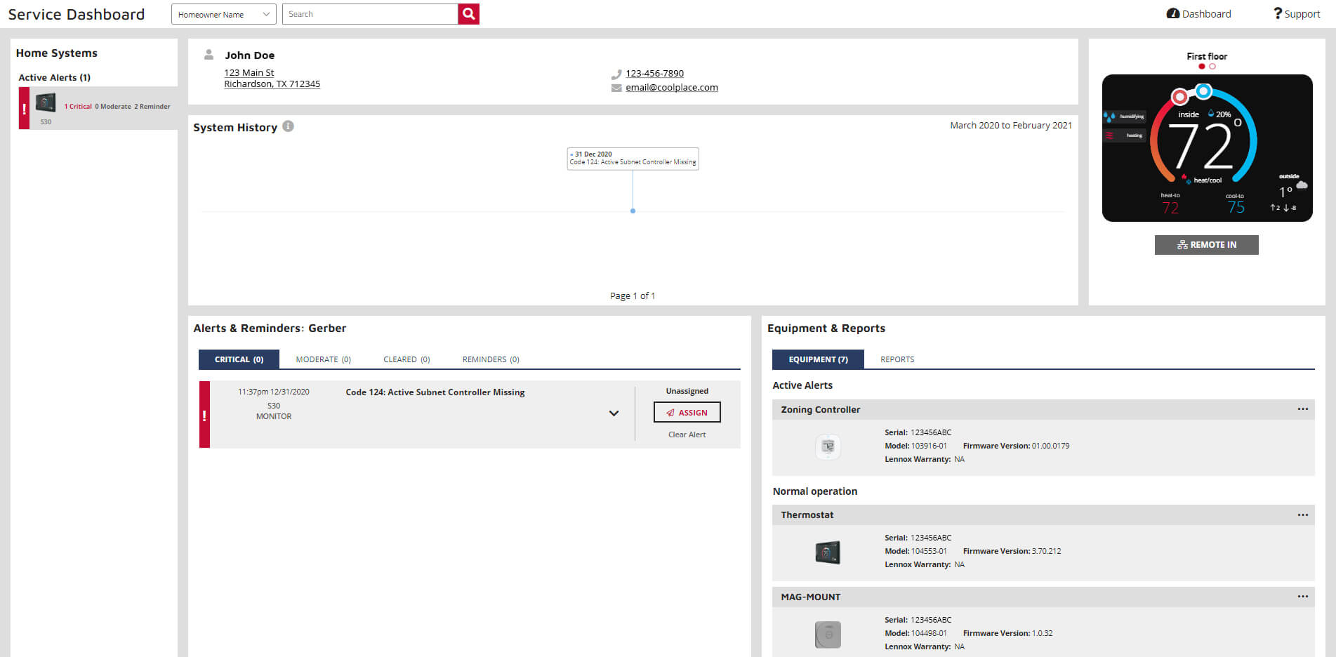
Example In Action: Service Dashboard
The Service Dashboard is action and information heavy, so organization is key. Using a card structure, we are able to create information islands, where each particular section focuses on one key task. In some cases, that’s giving actions to perform while other cards simply communicate information. There’s plenty of whitespace to give the design a better chance to communicate, and titling and structure are internally consistent to help orientation.
Standalone Example
Below is an example of a basic card with mixed content and a fixed width. Cards have no fixed width to start, so they'll naturally fill the full width of its parent element. This is easily customized with our various sizing options.
Card title
Some quick example text to build on the card title and make up the bulk of the card's content.
Go somewhere<div class="card" style="width: 18rem;">
<img src="..." class="card-img" alt="...">
<div class="card-body">
<h5 class="card-title">Card title</h5>
<p class="card-text">Some quick example text to build on the card title and make up the bulk of the card's content.</p>
<a href="#" class="btn btn-primary">Go somewhere</a>
</div>
</div>Content types
Cards support a wide variety of content, including images, text, list groups, links, and more. Below are examples of what's supported.
Body
The building block of a card is the `.card-body`. Use it whenever you need a padded section within a card.
The building block of a card is the body. Use it whenever you need a padded section within a card.
<div class="card">
  <div class="card-body">
    This is some text within a card body.
  </div>
</div>
Titles, text, and links
Card titles are used by adding `.card-title` to a `header` tag. In the same way, links are added and placed next to each other by adding `.card-link` to an `anchor` tag.
Card title
Some quick example text to build on the card title and make up the bulk of the card's content.
Card link<div class="card" style="width: 18rem;">
<div class="card-body">
<h5 class="card-title">Card title</h5>
<p class="card-text">Some quick example text to build on the card title and make up the bulk of the card's content.</p>
<a href="#" class="">Card link</a>
</div>
</div>Images
`.card-img` places an image to the top of the card. With `.card-text`, text can be added to the card. Text within `.card-text` can also be styled with the standard HTML tags.
Some quick example text to build on the card title and make up the bulk of the card's content.
<div class="card" style="width: 18rem;">
  <img src="..." class="card-img" alt="...">
  <div class="card-body">
    <p class="card-text">Some quick example text to build on the card title and make up the bulk of the card's content.</p>
  </div>
</div>
Kitchen sink
Mix and match multiple content types to create the card you need, or throw everything in there. Shown below are image styles, blocks, text styles, and a list group—all wrapped in a fixed-width card.
Card title
Some quick example text to build on the card title and make up the bulk of the card's content.
- Cras justo odio
- Dapibus ac facilisis in
- Vestibulum at eros
<div class="card" style="width: 18rem;">
  <img src="..." class="card-img" alt="...">
  <div class="card-body">
    <h5 class="card-title">Card title</h5>
    <p class="card-text">Some quick example text to build on the card title and make up the bulk of the card's content.</p>
  </div>
  <ul class="list-group list-group-flush">
    <li class="list-group-item">Cras justo odio</li>
    <li class="list-group-item">Dapibus ac facilisis in</li>
    <li class="list-group-item">Vestibulum at eros</li>
  </ul>
  <div class="card-body">
    <a href="#" class="card-link">Card link</a>
    <a href="#" class="card-link">Another link</a>
  </div>
</div>
Horizontal
Using a combination of grid and utility classes, cards can be made horizontal in a mobile-friendly and responsive way. In the example below, we remove the grid gutters with `.no-gutters` and use `.col-md-*` classes to make the card horizontal at the `md` breakpoint. Further adjustments may be needed depending on your card content.
Card title
This is a wider card with supporting text below as a natural lead-in to additional content. This content is a little bit longer.
Last updated 3 mins ago
<div class="card mb-3" style="max-width: 540px;">
  <div class="row no-gutters">
    <div class="col-md-4">
      <img src="..." class="card-img" alt="...">
    </div>
    <div class="col-md-8">
      <div class="card-body">
        <h5 class="card-title">Card title</h5>
        <p class="card-text">This is a wider card with supporting text below as a natural lead-in to additional content. This content is a little bit longer.</p>
        <p class="card-text"><small class="text-muted">Last updated 3 mins ago</small></p>
      </div>
    </div>
  </div>
</div>
Card layout
Used for items of the same size; often that stack with one another, either vertically or horizontally (like an image gallery). They use a 20px gutter.
Card decks
These structures are built using the cards shown above, alongside the Cirrus Grid system. These can be shown/hidden/moved on any of the built in breakpoints.
Each card inside the `col` element has a `h-100` class. This tells the item inside the flex row to be as large as the largest item in the row. This will scale as items are moved depending on screen size.
The `card` class is set to flex column, so you can use any of the flex utilities to space things around. In the below example, an extra flex utility of `d-flex` and `flex-column` is applied to the card-body, and a `mt-auto` to the last paragraph element to make it always show up at the bottom and in line with other elements in that row.
Card title
This is a longer card with supporting text below as a natural lead-in to additional content.
Last updated 3 mins ago
Card title
This is a longer card with supporting text below as a natural lead-in to additional content.
Last updated 3 mins ago
Card title
This is a longer card with supporting text below as a natural lead-in to additional content. This content is a little bit longer.
Last updated 3 mins ago
<div class="row">

  <div class="col-lg-4">
    <div class="card h-100">
      <img src="..." class="card-img" alt="...">
      <div class="card-body d-flex flex-column">
        <h5 class="card-title">Card title</h5>
        <p>This is a longer card with supporting text below as a natural lead-in to additional content. </p>
        <p class="mb-0 mt-auto small text-muted">Last updated 3 mins ago</p>
      </div>
    </div>
  </div>

  <div class="col-lg-4">
    <div class="card h-100">
      <img src="..." class="card-img" alt="...">
      <div class="card-body d-flex flex-column">
        <h5 class="card-title">Card title</h5>
        <p>This is a longer card with supporting text below as a natural lead-in to additional content. This content is a little bit longer.</p>
        <p class="mb-0 mt-auto small text-muted">Last updated 3 mins ago</p>
      </div>
    </div>
  </div>

</div>