How it works
Carousels should strive to give all the navigational power to the user. Carousels can auto-scroll, and if they do, once a user clicks an arrow, the auto-scroll should cease.
Our navigation at the bottom should be clear and easy to see, communicating where in the deck the user is located. Additionally, the navigation is clickable, allowing the user another way to move the carousel.
Building a new carousel?
We use a third party library called Slick Slider for all of our carousels. This library handles large, homepage-style sliders, and multi product carousel images too. It is very flexible and easily customizable. The code is not included by default in the library so you'll need to include it manually on your pages.
To include Slick Slider in your project, reference it like this:
<link rel="stylesheet" href="https://devcirrus.z21.web.core.windows.net/dist/css/library-slick-slider.min.css">
<script src="https://devcirrus.z21.web.core.windows.net/dist/js/library-slick-slider.min.js"></script>
Large Example


<div id="homepage-carousel-example">
  <div><img src="https://images.lennoxpros.com/is/image/LennoxIntl/2012-HeroBanner-Winter%20P%26S%20desktop?scl=1" alt="example of a homeapge banner" class="img-fluid"></div>
  <div><img src="https://images.lennoxpros.com/is/image/LennoxIntl/2005-NewPros_herobanner_why%20Lennox%20Pros_desktop-v2?scl=1" alt="example of a homeapge banner" class="img-fluid"></div>
  <div><img src="https://images.lennoxpros.com/is/image/LennoxIntl/1116-WinterCSRB-Herobanner?scl=1" alt="example of a homeapge banner" class="img-fluid"></div>
  <div><img src="https://images.lennoxpros.com/is/image/LennoxIntl/2011_MFMA%20Banner_desktop?scl=1" alt="example of a homeapge banner" class="img-fluid"></div>
</div>

<script>
  $('#homepage-carousel-example').slick();
</script>
Product Example
For best results, make sure to have a wrapping div around your content to prevent any layout issues. This example has the custom class `dark-arrows` to make the arrows show up when there isn't a background.
The below example also includes responsive properties so that the products arent squished on mobile.
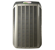
Cool New XC21 Galaxy 1
Cat #: 50W34
Model/Part #: XC21-024-230

Cool New XC21 Galaxy 2
Cat #: 50W34
Model/Part #: XC21-024-230

Cool New XC21 Galaxy 3
Cat #: 50W34
Model/Part #: XC21-024-230

Cool New XC21 Galaxy 4
Cat #: 50W34
Model/Part #: XC21-024-230

Cool New XC21 Galaxy 5
Cat #: 50W34
Model/Part #: XC21-024-230

Cool New XC21 Galaxy 6
Cat #: 50W34
Model/Part #: XC21-024-230
<div id="product-carousel-example" class="dark-arrows carousel-padding">
  <div><div class="product" data-catalog="12345">...</div></div>
  <div><div class="product" data-catalog="12345">...</div></div>
  <div><div class="product" data-catalog="12345">...</div></div>
  <div><div class="product" data-catalog="12345">...</div></div>
  <div><div class="product" data-catalog="12345">...</div></div>
</div>

<script>
  $('#product-carousel-example').slick({
    infinite: true,
    slidesToShow: 3,
    slidesToScroll: 3,
    responsive: [
      {
        breakpoint: 1200,
        settings: {
          slidesToShow: 2,
          slidesToScroll: 2
        }
      },
      {
        breakpoint: 768,
        settings: {
          slidesToShow: 1,
          slidesToScroll: 1
        }
      }
    ]
  });
</script>
Full Product Carousel Code
See all of the product carousel code here
The formatting is from a LiquidJS template so its not very pretty. Your IDE should correct the format when you copy it in.
<div id="cirrus-product-carousel-example" class="dark-arrows carousel-padding">


<div class="d-flex flex-column px-4 mb-lg-0 mb-5 h-100">
<div>
<img src="https://images.lennoxpros.com/is/image/LennoxIntl/50W34?$product_related$" alt="Product image" class="img-fluid d-block mx-auto">
</div>
<p class="font-size-20 font-weight-bold font-stack-header">Cool New XC21 Galaxy 1</p>
<p class="small mb-0">Cat #: 50W34</p>
<p class="small">Model/Part #: XC21-024-230</p>

<div class="add-to-cart-controls mt-auto">
<input type="number" class="form-control" placeholder="1" value="1" aria-label="Product Quantity" aria-describedby="add-to-cart-btn-1">
<button class="btn btn-secondary btn-block w-100" type="button" id="add-to-cart-btn-1">Add To Cart</button>
</div>
</div><!-- end col -->


<div class="d-flex flex-column px-4 mb-lg-0 mb-5 h-100">
<div>
<img src="https://images.lennoxpros.com/is/image/LennoxIntl/50W34?$product_related$" alt="Product image" class="img-fluid d-block mx-auto">
</div>
<p class="font-size-20 font-weight-bold font-stack-header">Cool New XC21 Galaxy 2</p>
<p class="small mb-0">Cat #: 50W34</p>
<p class="small">Model/Part #: XC21-024-230</p>

<div class="add-to-cart-controls mt-auto">
<input type="number" class="form-control" placeholder="1" value="1" aria-label="Product Quantity" aria-describedby="add-to-cart-btn-2">
<button class="btn btn-secondary btn-block w-100" type="button" id="add-to-cart-btn-2">Add To Cart</button>
</div>
</div><!-- end col -->


<div class="d-flex flex-column px-4 mb-lg-0 mb-5 h-100">
<div>
<img src="https://images.lennoxpros.com/is/image/LennoxIntl/50W34?$product_related$" alt="Product image" class="img-fluid d-block mx-auto">
</div>
<p class="font-size-20 font-weight-bold font-stack-header">Cool New XC21 Galaxy 3</p>
<p class="small mb-0">Cat #: 50W34</p>
<p class="small">Model/Part #: XC21-024-230</p>

<div class="add-to-cart-controls mt-auto">
<input type="number" class="form-control" placeholder="1" value="1" aria-label="Product Quantity" aria-describedby="add-to-cart-btn-3">
<button class="btn btn-secondary btn-block w-100" type="button" id="add-to-cart-btn-3">Add To Cart</button>
</div>
</div><!-- end col -->


<div class="d-flex flex-column px-4 mb-lg-0 mb-5 h-100">
<div>
<img src="https://images.lennoxpros.com/is/image/LennoxIntl/50W34?$product_related$" alt="Product image" class="img-fluid d-block mx-auto">
</div>
<p class="font-size-20 font-weight-bold font-stack-header">Cool New XC21 Galaxy 4</p>
<p class="small mb-0">Cat #: 50W34</p>
<p class="small">Model/Part #: XC21-024-230</p>

<div class="add-to-cart-controls mt-auto">
<input type="number" class="form-control" placeholder="1" value="1" aria-label="Product Quantity" aria-describedby="add-to-cart-btn-4">
<button class="btn btn-secondary btn-block w-100" type="button" id="add-to-cart-btn-4">Add To Cart</button>
</div>
</div><!-- end col -->


</div>
