Global settings
Cirrus sets basic global display, typography, and link styles. When more control is needed, check out the textual utility classes.
Fonts
Calling the fonts in your project
  <link rel="preconnect" href="https://fonts.gstatic.com">
  <link href="https://fonts.googleapis.com/css2?family=Kanit:wght@200;300;400&family=Maven+Pro:wght@400;500;700;900&family=Open+Sans:ital,wght@0,400;0,600;0,700;1,400;1,600;1,700&display=swap" rel="stylesheet">
Calling the fonts in CSS
  font-family: 'Kanit', sans-serif;
  font-family: 'Maven Pro', sans-serif;
  font-family: 'Open Sans', sans-serif;
| Heading | Example |
|---|---|
|
|
h1. Cirrus heading |
|
|
h2. Cirrus heading |
|
|
h3. Cirrus heading |
|
|
h4. Cirrus heading |
Desktop Sizes
| Example | Font | Size / Line Height | Weight |
|---|---|---|---|
| h1. Cirrus heading | Maven Pro | 50/64 | 400 |
| h2. Cirrus heading | Maven Pro | 38/50 | 400 |
| h3. Cirrus heading | Maven Pro | 26/36 | 500 |
| h4. Cirrus heading | Maven Pro | 20/28 | 500 |
Tablet Sizes
| Example | Font | Size / Line Height | Weight |
|---|---|---|---|
| h1. Cirrus heading | Maven Pro | 44/60 | 400 |
| h2. Cirrus heading | Maven Pro | 32/46 | 400 |
| h3. Cirrus heading | Maven Pro | 22/34 | 500 |
| h4. Cirrus heading | Maven Pro | 18/26 | 500 |
Mobile Sizes
| Example | Font | Size / Line Height | Weight |
|---|---|---|---|
| h1. Cirrus heading | Kanit | 28/44 | 200 |
| h2. Cirrus heading | Kanit | 24/38 | 300 |
| h3. Cirrus heading | Kanit | 20/30 | 400 |
| h4. Cirrus heading | Kanit | 18/26 | 400 |
<h1>h1. Cirrus heading</h1>
<h2>h2. Cirrus heading</h2>
<h3>h3. Cirrus heading</h3>
<h4>h4. Cirrus heading</h4>
`.h1` through `.h4` classes are also available, for when you want to match the font styling of a heading but cannot use the associated HTML element.
h1. Cirrus heading
h2. Cirrus heading
h3. Cirrus heading
h4. Cirrus heading
<p class="h1">h1. Cirrus heading</p>
<p class="h2">h2. Cirrus heading</p>
<p class="h3">h3. Cirrus heading</p>
<p class="h4">h4. Cirrus heading</p>
Font Weight Guide
Ever wondered what all the numbers mean?
| Number | Name |
|---|---|
| 100 | Thin |
| 200 | Extra Light |
| 300 | Light |
| 400 | Regular |
| 500 | Medium |
| 600 | Semi-bold |
| 700 | Bold |
| 800 | Extra Bold |
| 900 | Black |
Directly reference the font families
Need to apply a header font to a paragraph tag or small header? You can use these classes below. The names are intentionally generic so if the brand switches in the future, the class names won't need to be altered.
<p class="font-stack-header">Maven Pro</p>
<p class="font-stack-base">Open Sans</p>
<p class="font-stack-header-mobile">Kanit</p>
Header Links
Header tags can also be used as links, and do not show the typical blue color. They inherit their color from the parent, so if the text is usually #222, then the link will also be #222. They also do not have an underlined state until hovered or focused on.
<h1><a href="#">h1. Cirrus heading</a></h1>
<h2><a href="#">h2. Cirrus heading</a></h2>
<h3><a href="#">h3. Cirrus heading</a></h3>
<h4><a href="#">h4. Cirrus heading</a></h4>
Linking entire blocks of content
For situations where a block of content needs to link out, use the `stretched-link` class instead of trying to wrap the content in a link. You can read more about that here:
Customizing headings
Use the included utility classes to recreate the small secondary heading text from Cirrus.
Fancy display heading With faded secondary text
<h3>
  Fancy display heading
  <small class="text-muted">With faded secondary text</small>
</h3>
Ordering paragraph-based content
These elements are not created with header tags, but still have a hierarchy within a component.
Example: Product Listing Page
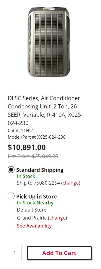
Our product listing page follows a hierarchy of both text and color. The main heading is larger than the rest of the text, using a lighter style. We call attention to the price, as it’s often the most important piece of information a consumer needs/wants. These two pieces are the most valuable and thus, are presented towards the of the design, and they are the largest.
Second order information (like list price, availability, and other lower used information) is presented in a smaller font. Why is it okay to break the sizing rules here? There’s a clear hierarchy of information that we want to present, putting forward more valuable information and placing other information in the background. This is called progressive disclosure. We are slowly revealing, through the design, what information the user wants and when they expect to want it.
Generally, a user will think, consciously or unconsciously, in steps. What’s the right product? How much is it? Where can I get it? I want to get it. Our design mirrors that consideration process.
Lead
Make a paragraph stand out by adding `.lead`.
Vivamus sagittis lacus vel augue laoreet rutrum faucibus dolor auctor. Duis mollis, est non commodo luctus.
<p class="lead">
  Vivamus sagittis lacus vel augue laoreet rutrum faucibus dolor auctor. Duis mollis, est non commodo luctus.
</p>
Inline text elements
Styling for common inline HTML5 elements.
You can use the mark tag to highlight text.
This line of text is meant to be treated as deleted text.
This line of text is meant to be treated as no longer accurate.
This line of text is meant to be treated as fine print.
This line rendered as bold text.
This line rendered as italicized text.
<p>You can use the mark tag to <mark>highlight</mark> text.</p>
<p><del>This line of text is meant to be treated as deleted text.</del></p>
<p><s>This line of text is meant to be treated as no longer accurate.</s></p>
<p><small>This line of text is meant to be treated as fine print.</small></p>
<p><strong>This line rendered as bold text.</strong></p>
<p><em>This line rendered as italicized text.</em></p>
`.mark` and `.small` classes are also available to apply the same styles as `mark` and `small` while avoiding any unwanted semantic implications that the tags would bring.
While not shown above, feel free to use `b` and `i` in HTML5. `b` is meant to highlight words or phrases without conveying additional importance while `i` is mostly for voice, technical terms, etc.
Text color utilities
All the lennox colors are supported for easy inline class usage. These work great for titles and applying different colors to icons.
Red Text Example
Dark Red Text Example
Light Red Text Example
Green Text Example
Dark Green Text Example
Light Green Text Example
Gold Text Example
Dark Gold Text Example
Light Gold Text Example
Blue Text Example
Dark Blue Text Example
Light Blue Text Example
Light Blue Alt Text Example
Black Text Example
Dark Grey Text Example
Medium Grey Text Example
Grey Text Example
Light Grey Text Example
<p class="p-4 color-red">Red Text Example</p>
<p class="p-4 color-red-dark">Dark Red Text Example</p>
<p class="p-4 color-red-light">Light Red Text Example</p>
<p class="p-4 color-green">Green Text Example</p>
<p class="p-4 color-green-dark">Dark Green Text Example</p>
<p class="p-4 color-green-light">Light Green Text Example</p>
<p class="p-4 color-gold">Gold Text Example</p>
<p class="p-4 color-gold-dark">Dark Gold Text Example</p>
<p class="p-4 color-gold-light">Light Gold Text Example</p>
<p class="p-4 color-blue">Blue Text Example</p>
<p class="p-4 color-blue-dark">Dark Blue Text Example</p>
<p class="p-4 color-blue-light">Light Blue Text Example</p>
<p class="p-4 color-blue-light-alt">Light Blue Alt Text Example</p>
<p class="p-4 color-black">Black Text Example</p>
<p class="p-4 color-dark-grey">Dark Grey Text Example</p>
<p class="p-4 color-medium-grey">Medium Grey Text Example</p>
<p class="p-4 color-lennox-grey">Grey Text Example</p>
<p class="p-4 color-light-grey">Light Grey Text Example</p>
Background color utilities
All the lennox colors are supported for easy background color usage. These work great standalone content or needing to style any elements with a custom background color. The `p-4` class is just to make the content show larger. That padding class can be removed when used on a project.
Make sure the color contrast is legible to users with decreased vision or color blindness.
Red Text Example
Dark Red Text Example
Light Red Text Example
Green Text Example
Dark Green Text Example
Light Green Text Example
Gold Text Example
Dark Gold Text Example
Light Gold Text Example
Blue Text Example
Dark Blue Text Example
Light Blue Text Example
Light Blue Alt Text Example
Black Text Example
Dark Grey Text Example
Medium Grey Text Example
Grey Text Example
Light Grey Text Example
<p class="p-4 bg-red">Red Text Example</p>
<p class="p-4 bg-red-dark">Dark Red Text Example</p>
<p class="p-4 bg-red-light">Light Red Text Example</p>
<p class="p-4 bg-green">Green Text Example</p>
<p class="p-4 bg-green-dark">Dark Green Text Example</p>
<p class="p-4 bg-green-light">Light Green Text Example</p>
<p class="p-4 bg-gold">Gold Text Example</p>
<p class="p-4 bg-gold-dark">Dark Gold Text Example</p>
<p class="p-4 bg-gold-light">Light Gold Text Example</p>
<p class="p-4 bg-blue">Blue Text Example</p>
<p class="p-4 bg-blue-dark">Dark Blue Text Example</p>
<p class="p-4 bg-blue-light">Light Blue Text Example</p>
<p class="p-4 bg-blue-light-alt">Light Blue Alt Text Example</p>
<p class="p-4 bg-black">Black Text Example</p>
<p class="p-4 bg-dark-grey">Dark Grey Text Example</p>
<p class="p-4 bg-medium-grey">Medium Grey Text Example</p>
<p class="p-4 bg-lennox-grey">Grey Text Example</p>
<p class="p-4 bg-light-grey">Light Grey Text Example</p>
More Text utilities
Change text alignment, transform, style, weight, and color with our text utilities and color utilities.
Abbreviations
Stylized implementation of HTML's `abbr` element for abbreviations and acronyms to show the expanded version on hover. Abbreviations have a default underline and gain a help cursor to provide additional context on hover and to users of assistive technologies.
Add `.initialism` to an abbreviation for a slightly smaller font-size.
attr
HTML
<p><abbr title="attribute">attr</abbr></p>
<p><abbr title="HyperText Markup Language" class="initialism">HTML</abbr></p>
Blockquotes
For quoting blocks of content from another source within your document. Wrap `<blockquote class='blockquote'></blockquote>` around any `<abbr title='HyperText Markup Language'>HTML</abbr>` as the quote.
Lorem ipsum dolor sit amet, consectetur adipiscing elit. Integer posuere erat a ante.
<blockquote class="blockquote">
  <p class="mb-0">Lorem ipsum dolor sit amet, consectetur adipiscing elit. Integer posuere erat a ante.</p>
</blockquote>
Naming a source
Add a <footer class='blockquote-footer'></footer> for identifying the source. Wrap the name of the source work in `cite` tag.
Lorem ipsum dolor sit amet, consectetur adipiscing elit. Integer posuere erat a ante.
<blockquote class="blockquote">
  <p class="mb-0">Lorem ipsum dolor sit amet, consectetur adipiscing elit. Integer posuere erat a ante.</p>
  <footer class="blockquote-footer">Someone famous in <cite title="Source Title">Source Title</cite></footer>
</blockquote>
Lists
Unstyled
Remove the default `list-style` and left margin on list items (immediate children only). This only applies to immediate children list items, meaning you will need to add the class for any nested lists as well.
- Lorem ipsum dolor sit amet
- Consectetur adipiscing elit
- Integer molestie lorem at massa
- Facilisis in pretium nisl aliquet
- Nulla volutpat aliquam velit
- Phasellus iaculis neque
- Purus sodales ultricies
- Vestibulum laoreet porttitor sem
- Ac tristique libero volutpat at
- Faucibus porta lacus fringilla vel
- Aenean sit amet erat nunc
- Eget porttitor lorem
<ul class="list-unstyled">
  <li>Lorem ipsum dolor sit amet</li>
  <li>Consectetur adipiscing elit</li>
  <li>Integer molestie lorem at massa</li>
  <li>Facilisis in pretium nisl aliquet</li>
  <li>Nulla volutpat aliquam velit
    <ul>
      <li>Phasellus iaculis neque</li>
      <li>Purus sodales ultricies</li>
      <li>Vestibulum laoreet porttitor sem</li>
      <li>Ac tristique libero volutpat at</li>
    </ul>
  </li>
  <li>Faucibus porta lacus fringilla vel</li>
  <li>Aenean sit amet erat nunc</li>
  <li>Eget porttitor lorem</li>
</ul>
Inline
Remove a list's bullets and apply some light `margin` with a combination of two classes, `.list-inline` and `.list-inline-item`.
- Lorem ipsum
- Phasellus iaculis
- Nulla volutpat
<ul class="list-inline">
  <li class="list-inline-item">Lorem ipsum</li>
  <li class="list-inline-item">Phasellus iaculis</li>
  <li class="list-inline-item">Nulla volutpat</li>
</ul>
Description list alignment
Align terms and descriptions horizontally by using our grid system's predefined classes (or semantic mixins). For longer terms, you can optionally add a `.text-truncate` class to truncate the text with an ellipsis.
- Description lists
- A description list is perfect for defining terms.
- Euismod
-
Vestibulum id ligula porta felis euismod semper eget lacinia odio sem nec elit.
Donec id elit non mi porta gravida at eget metus.
- Malesuada porta
- Etiam porta sem malesuada magna mollis euismod.
- Truncated term is truncated
- Fusce dapibus, tellus ac cursus commodo, tortor mauris condimentum nibh, ut fermentum massa justo sit amet risus.
- Nesting
-
- Nested definition list
- Aenean posuere, tortor sed cursus feugiat, nunc augue blandit nunc.
<dl class="row">
  <dt class="col-sm-3">Description lists</dt>
  <dd class="col-sm-9">A description list is perfect for defining terms.</dd>

  <dt class="col-sm-3">Euismod</dt>
  <dd class="col-sm-9">
    <p>Vestibulum id ligula porta felis euismod semper eget lacinia odio sem nec elit.</p>
    <p>Donec id elit non mi porta gravida at eget metus.</p>
  </dd>

  <dt class="col-sm-3">Malesuada porta</dt>
  <dd class="col-sm-9">Etiam porta sem malesuada magna mollis euismod.</dd>

  <dt class="col-sm-3 text-truncate">Truncated term is truncated</dt>
  <dd class="col-sm-9">Fusce dapibus, tellus ac cursus commodo, tortor mauris condimentum nibh, ut fermentum massa justo sit amet risus.</dd>

  <dt class="col-sm-3">Nesting</dt>
  <dd class="col-sm-9">
    <dl class="row">
      <dt class="col-sm-4">Nested definition list</dt>
      <dd class="col-sm-8">Aenean posuere, tortor sed cursus feugiat, nunc augue blandit nunc.</dd>
    </dl>
  </dd>
</dl>
Additional font size utilities
Legal 12px
Apparently we had reached a great height in the atmosphere, for the sky was a dead black, and the stars had ceased to twinkle. By the same illusion which lifts the horizon of the sea to the level of the spectator on a hillside, the sable cloud beneath was dished out, and the car seemed to float in the middle of an immense dark sphere, whose upper half was strewn with silver.
<p class="legal-copy">...</p>
Caption 14px
Apparently we had reached a great height in the atmosphere, for the sky was a dead black, and the stars had ceased to twinkle. By the same illusion which lifts the horizon of the sea to the level of the spectator on a hillside, the sable cloud beneath was dished out, and the car seemed to float in the middle of an immense dark sphere, whose upper half was strewn with silver.
<p class="caption-copy">...</p>