How it works
Columns run vertically, from the top of the page all the way to the bottom. Columns are flexible; their width changes based on the left and right margin, as well as the gutter width. However, bootstrap uses a base column structure of 12, as noted below, which consequently maintains the consistency of elements being divisible by 4. There can be fewer than 12 columns, based on breakpoints and screen devices, but internal structures should user numbers that are factors of 12. By maintaining stable margins and gutters, columns become an extremely flexible design opportunity, providing structural order as well as creative opportunity.
Cirrus's grid system uses a series of containers, rows, and columns to layout and align content. It's built with flexbox and is fully responsive. Below is an example and an in-depth look at how the grid comes together.
New to or unfamiliar with flexbox? Read this CSS Tricks flexbox guide for background, terminology, guidelines, and code snippets.
<div class="container">
  <div class="row">
    <div class="col-sm">
      One of three columns
    </div>
    <div class="col-sm">
      One of three columns
    </div>
    <div class="col-sm">
      One of three columns
    </div>
  </div>
</div>
The above example creates three equal-width columns on small, medium, large, and extra large devices using our predefined grid classes. Those columns are centered in the page with the parent `.container`.
Breaking it down, here's how it works:
- Containers provide a means to center and horizontally pad your site's contents. Use `.container` for a responsive pixel width or `.container-fluid` for `width: 100%` across all viewport and device sizes.
- Rows are wrappers for columns. Each column has horizontal `padding` (called a gutter) for controlling the space between them. This `padding` is then counteracted on the rows with negative margins. This way, all the content in your columns is visually aligned down the left side.
- In a grid layout, content must be placed within columns and only columns may be immediate children of rows.
- Thanks to flexbox, grid columns without a specified `width` will automatically layout as equal width columns. For example, four instances of `.col-sm` will each automatically be 25% wide from the small breakpoint and up. See the auto-layout columns section for more examples.
- Column classes indicate the number of columns you'd like to use out of the possible 12 per row. So, if you want three equal-width columns across, you can use `.col-4`.
- Column `width`s are set in percentages, so they're always fluid and sized relative to their parent element.
- Columns have horizontal `padding` to create the gutters between individual columns, however, you can remove the `margin` from rows and `padding` from columns with `.no-gutters` on the `.row`.
- To make the grid responsive, there are five grid breakpoints, one for each responsive breakpoint all breakpoints (extra small), small, medium, large, and extra large.
- Grid breakpoints are based on minimum width media queries, meaning they apply to that one breakpoint and all those above it (e.g., `.col-sm-4` applies to small, medium, large, and extra large devices, but not the first `xs` breakpoint).
- You can use predefined grid classes (like `.col-4`) for more semantic markup.
Be aware of the limitations and bugs around flexbox, like the inability to use some HTML elements as flex containers.
Grid options
While Cirrus uses `em`s or `rem`s for defining most sizes, `px`s are used for grid breakpoints and container widths. This is because the viewport width is in pixels and does not change with the font size.
See how aspects of the Cirrus grid system work across multiple devices with a handy table.
|
Extra small <576px |
Small ≥576px |
Medium ≥768px |
Large ≥992px |
Extra large ≥1200px |
Extra extra large ≥1560px |
|
|---|---|---|---|---|---|---|
| Max container width | None (auto) | 540px | 720px | 960px | 1140px | 1500px |
| Class prefix | .col- |
.col-sm- |
.col-md- |
.col-lg- |
.col-xl- |
.col-xxl- |
| # of columns | 12 | |||||
| Gutter width | 20px (10px on each side of a column) | |||||
| Nestable | Yes | |||||
| Column ordering | Yes | |||||
Auto-layout columns
Utilize breakpoint-specific column classes for easy column sizing without an explicit numbered class like `.col-sm-6`.
Equal-width
For example, here are two grid layouts that apply to every device and viewport, from `xs` to `xl`. Add any number of unit-less classes for each breakpoint you need and every column will be the same width.
<div class="container">
  <div class="row">
    <div class="col">
      1 of 2
    </div>
    <div class="col">
      2 of 2
    </div>
  </div>
  <div class="row">
    <div class="col">
      1 of 3
    </div>
    <div class="col">
      2 of 3
    </div>
    <div class="col">
      3 of 3
    </div>
  </div>
</div>
Equal-width multi-line
Create equal-width columns that span multiple lines by inserting a `.w-100` where you want the columns to break to a new line. Make the breaks responsive by mixing `.w-100` with some responsive display utilities.
There was a Safari flexbox bug that prevented this from working without an explicit `flex-basis` or `border`. There are workarounds for older browser versions, but they shouldn't be necessary if your target browsers don't fall into the buggy versions.
<div class="container">
  <div class="row">
    <div class="col">col</div>
    <div class="col">col</div>
    <div class="w-100"></div>
    <div class="col">col</div>
    <div class="col">col</div>
  </div>
</div>
Setting one column width
Auto-layout for flexbox grid columns also means you can set the width of one column and have the sibling columns automatically resize around it. You may use predefined grid classes (as shown below), grid mixins, or inline widths. Note that the other columns will resize no matter the width of the center column.
<div class="container">
  <div class="row">
    <div class="col">
      1 of 3
    </div>
    <div class="col-6">
      2 of 3 (wider)
    </div>
    <div class="col">
      3 of 3
    </div>
  </div>
  <div class="row">
    <div class="col">
      1 of 3
    </div>
    <div class="col-5">
      2 of 3 (wider)
    </div>
    <div class="col">
      3 of 3
    </div>
  </div>
</div>
Variable width content
Use `col-{breakpoint}-auto` classes to size columns based on the natural width of their content.
<div class="container">
  <div class="row justify-content-md-center">
    <div class="col col-lg-2">
      1 of 3
    </div>
    <div class="col-md-auto">
      Variable width content
    </div>
    <div class="col col-lg-2">
      3 of 3
    </div>
  </div>
  <div class="row">
    <div class="col">
      1 of 3
    </div>
    <div class="col-md-auto">
      Variable width content
    </div>
    <div class="col col-lg-2">
      3 of 3
    </div>
  </div>
</div>
Gutters
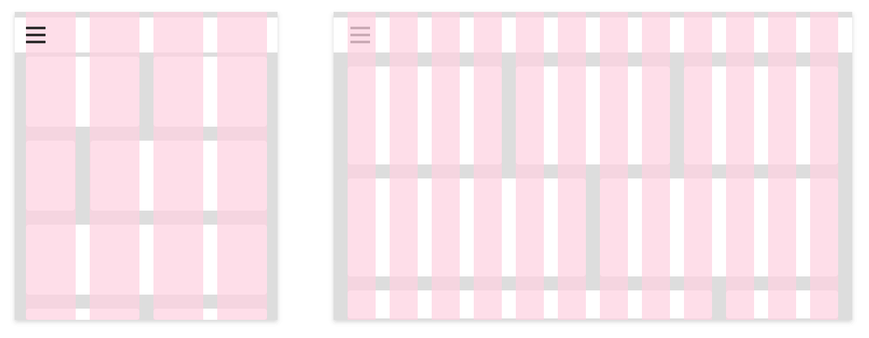
Gutters are always 20 pixels, both vertically and horizontally. Simple.
Gutters between column elements are 10px on each side for a total of 20px.
No gutters
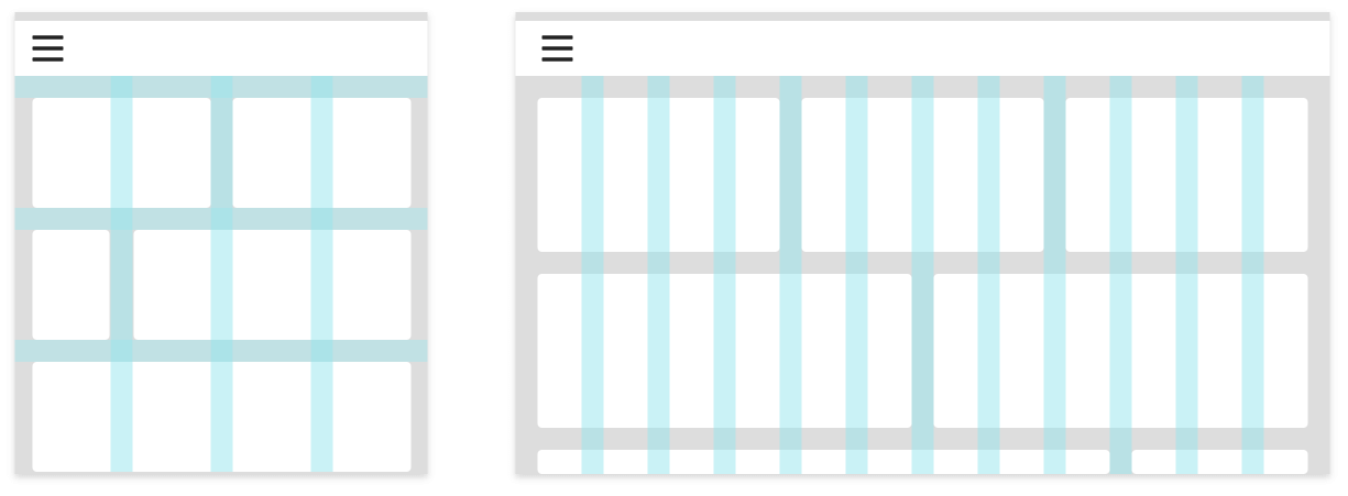
The gutters between columns in our predefined grid classes can be removed with `.no-gutters`. This removes the negative `margin`s from `.row` and the horizontal `padding` from all immediate children columns.
Note that column overrides are scoped to only the first children columns and are targeted via attribute selector. While this generates a more specific selector, column padding can still be further customized with spacing utilities.
In practice, here's how it looks. Note you can continue to use this with all other predefined grid classes (including column widths, responsive tiers, reorders, and more).
  <div class="row no-gutters">
    <div class="col-sm-6 col-md-8">.col-sm-6 .col-md-8</div>
    <div class="col-6 col-md-4">.col-6 .col-md-4</div>
  </div>
How To Break Designs
Generally, if your page is well-structured and coherent, breaking it from desktop down to mobile is fairly easy. First, there are two things to consider.
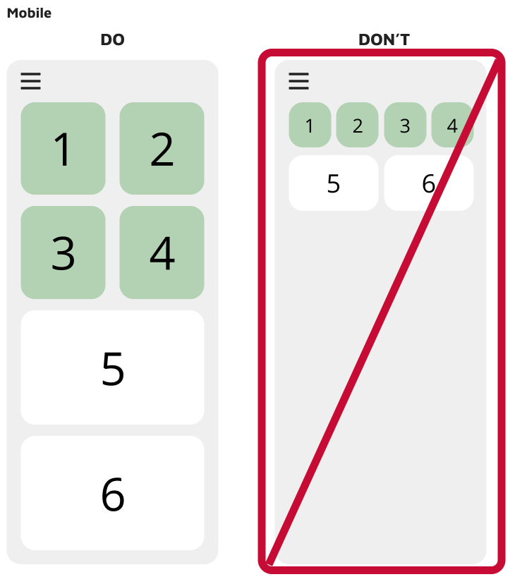
First: Is there an element on the page that has to stay the same size? Things like filters and navigation always have to be a certain size to allow for tapping, so those elements must be considered first. Can they stay on screen? If not, how do we put them under a menu, or do we need another design solution?
Second: What other elements need to stay grouped together and on-screen for coherence and utility? Which elements can be hidden, either through links, a carousel, or some other navigational structure? The general rule is primary action and important information stay on screen; secondary stuff can either be hidden or pushed down the page.
Once you’ve answered these two questions, it’s just a simple task of reorganizing your cards to flow down the page in the same structure someone would read the information across the page. Remember: for our purposes, people read from left to right, top to bottom.
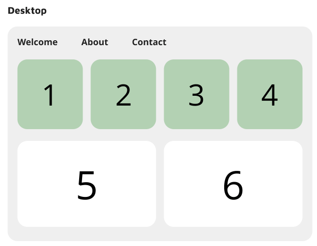
Example: In the example on the right, we are sizing down from about 620 to around 300 pixels. Since we are moving to mobile, I’ve decided to move the main navigation links into a hamburger menu, to focus more on the content of the page.
Sections 1, 2, 3 and 4 are a part of a grouping, and I want to keep them all on the page. Sections 5 and 6 are completely separate.
The choice made here is to keep all four items on screen, and simple stack them as the page shrinks. 1 and 2 stay on the top row, while 3 and 4 move underneath. Since we read from left to right, up to down, the order of the array is consistent, but is now on two lines rather than one.
Since sections 5 and 6 are their own contained sections, they can resize based on width, with the content flowing as far down the page as is necessary.
Responsive classes
Cirrus's grid includes five tiers of predefined classes for building complex responsive layouts. Customize the size of your columns on extra small, small, medium, large, or extra large devices however you see fit.
All breakpoints
For grids that are the same from the smallest of devices to the largest, use the `.col` and `.col-*` classes. Specify a numbered class when you need a particularly sized column; otherwise, feel free to stick to `.col`.
<div class="container">
  <div class="row">
    <div class="col">col</div>
    <div class="col">col</div>
    <div class="col">col</div>
    <div class="col">col</div>
  </div>
  <div class="row">
    <div class="col-8">col-8</div>
    <div class="col-4">col-4</div>
  </div>
</div>
Stacked to horizontal
Using a single set of `.col-sm-*` classes, you can create a basic grid system that starts out stacked and becomes horizontal at the small breakpoint (`sm`).
<div class="container">
  <div class="row">
    <div class="col-sm-8">col-sm-8</div>
    <div class="col-sm-4">col-sm-4</div>
  </div>
  <div class="row">
    <div class="col-sm">col-sm</div>
    <div class="col-sm">col-sm</div>
    <div class="col-sm">col-sm</div>
  </div>
</div>
Mix and match
Don't want your columns to simply stack in some grid tiers? Use a combination of different classes for each tier as needed. See the example below for a better idea of how it all works.
<div class="container">
  <!-- Stack the columns on mobile by making one full-width and the other half-width -->
  <div class="row">
    <div class="col-md-8">.col-md-8</div>
    <div class="col-6 col-md-4">.col-6 .col-md-4</div>
  </div>

  <!-- Columns start at 50% wide on mobile and bump up to 33.3% wide on desktop -->
  <div class="row">
    <div class="col-6 col-md-4">.col-6 .col-md-4</div>
    <div class="col-6 col-md-4">.col-6 .col-md-4</div>
    <div class="col-6 col-md-4">.col-6 .col-md-4</div>
  </div>

  <!-- Columns are always 50% wide, on mobile and desktop -->
  <div class="row">
    <div class="col-6">.col-6</div>
    <div class="col-6">.col-6</div>
  </div>
</div>
Row columns
Use the responsive `.row-cols-*` classes to quickly set the number of columns that best render your content and layout. Whereas normal `.col-*` classes apply to the individual columns (e.g., `.col-md-4`), the row columns classes are set on the parent `.row` as a shortcut.
Use these row columns classes to quickly create basic grid layouts or to control your card layouts.
<div class="container">
  <div class="row row-cols-2">
    <div class="col">Column</div>
    <div class="col">Column</div>
    <div class="col">Column</div>
    <div class="col">Column</div>
  </div>
</div><div class="container">
<div class="row row-cols-3">
<div class="col">Column</div>
<div class="col">Column</div>
<div class="col">Column</div>
<div class="col">Column</div>
</div>
</div><div class="container">
<div class="row row-cols-4">
<div class="col">Column</div>
<div class="col">Column</div>
<div class="col">Column</div>
<div class="col">Column</div>
</div>
</div><div class="container">
<div class="row row-cols-4">
<div class="col">Column</div>
<div class="col">Column</div>
<div class="col-6">Column</div>
<div class="col">Column</div>
</div>
</div><div class="container">
<div class="row row-cols-1 row-cols-sm-2 row-cols-md-4">
<div class="col">Column</div>
<div class="col">Column</div>
<div class="col">Column</div>
<div class="col">Column</div>
</div>
</div>Alignment
Use flexbox alignment utilities to vertically and horizontally align columns. **Internet Explorer 10-11 do not support vertical alignment of flex items when the flex container has a `min-height` as shown below.** See Flexbugs #3 for more details.
Vertical alignment
<div class="container">
  <div class="row align-items-start">
    <div class="col">
      One of three columns
    </div>
    <div class="col">
      One of three columns
    </div>
    <div class="col">
      One of three columns
    </div>
  </div>
  <div class="row align-items-center">
    <div class="col">
      One of three columns
    </div>
    <div class="col">
      One of three columns
    </div>
    <div class="col">
      One of three columns
    </div>
  </div>
  <div class="row align-items-end">
    <div class="col">
      One of three columns
    </div>
    <div class="col">
      One of three columns
    </div>
    <div class="col">
      One of three columns
    </div>
  </div>
</div><div class="container">
<div class="row">
<div class="col align-self-start">
One of three columns
</div>
<div class="col align-self-center">
One of three columns
</div>
<div class="col align-self-end">
One of three columns
</div>
</div>
</div>Horizontal alignment
<div class="container">
  <div class="row justify-content-start">
    <div class="col-4">
      One of two columns
    </div>
    <div class="col-4">
      One of two columns
    </div>
  </div>
  <div class="row justify-content-center">
    <div class="col-4">
      One of two columns
    </div>
    <div class="col-4">
      One of two columns
    </div>
  </div>
  <div class="row justify-content-end">
    <div class="col-4">
      One of two columns
    </div>
    <div class="col-4">
      One of two columns
    </div>
  </div>
  <div class="row justify-content-around">
    <div class="col-4">
      One of two columns
    </div>
    <div class="col-4">
      One of two columns
    </div>
  </div>
  <div class="row justify-content-between">
    <div class="col-4">
      One of two columns
    </div>
    <div class="col-4">
      One of two columns
    </div>
  </div>
</div>
Column wrapping
If more than 12 columns are placed within a single row, each group of extra columns will, as one unit, wrap onto a new line.
Since 9 + 4 = 13 > 12, this 4-column-wide div gets wrapped onto a new line as one contiguous unit.
Subsequent columns continue along the new line.
<div class="container">
<div class="row">
<div class="col-9">.col-9</div>
<div class="col-4">.col-4<br>Since 9 + 4 = 13 > 12, this 4-column-wide div gets wrapped onto a new line as one contiguous unit.</div>
<div class="col-6">.col-6<br>Subsequent columns continue along the new line.</div>
</div>
</div>Column breaks
Breaking columns to a new line in flexbox requires a small hack: add an element with `width: 100%` wherever you want to wrap your columns to a new line. Normally this is accomplished with multiple `.row`s, but not every implementation method can account for this.
<div class="container">
  <div class="row">
    <div class="col-6 col-sm-3">.col-6 .col-sm-3</div>
    <div class="col-6 col-sm-3">.col-6 .col-sm-3</div>

    <!-- Force next columns to break to new line -->
    <div class="w-100"></div>

    <div class="col-6 col-sm-3">.col-6 .col-sm-3</div>
    <div class="col-6 col-sm-3">.col-6 .col-sm-3</div>
  </div>
</div>
You may also apply this break at specific breakpoints with our responsive display utilities.
<div class="container">
  <div class="row">
    <div class="col-6 col-sm-4">.col-6 .col-sm-4</div>
    <div class="col-6 col-sm-4">.col-6 .col-sm-4</div>

    <!-- Force next columns to break to new line at md breakpoint and up -->
    <div class="w-100 d-none d-md-block"></div>

    <div class="col-6 col-sm-4">.col-6 .col-sm-4</div>
    <div class="col-6 col-sm-4">.col-6 .col-sm-4</div>
  </div>
</div>
Reordering
Order classes
Use `.order-` classes for controlling the visual order of your content. These classes are responsive, so you can set the `order` by breakpoint (e.g., `.order-1.order-md-2`). Includes support for `1` through `12` across all five grid tiers.
<div class="container">
  <div class="row">
    <div class="col">
      First in DOM, no order applied
    </div>
    <div class="col order-12">
      Second in DOM, with a larger order
    </div>
    <div class="col order-1">
      Third in DOM, with an order of 1
    </div>
  </div>
</div>
There are also responsive `.order-first` and `.order-last` classes that change the `order` of an element by applying `order: -1` and `order: 13` (`order: $columns + 1`), respectively. These classes can also be intermixed with the numbered `.order-*` classes as needed.
<div class="container">
  <div class="row">
    <div class="col order-last">
      First in DOM, ordered last
    </div>
    <div class="col">
      Second in DOM, unordered
    </div>
    <div class="col order-first">
      Third in DOM, ordered first
    </div>
  </div>
</div>
Offsetting columns
You can offset grid columns in two ways: our responsive `.offset-` grid classes and our margin utilities. Grid classes are sized to match columns while margins are more useful for quick layouts where the width of the offset is variable.
Offset classes
Move columns to the right using `.offset-md-*` classes. These classes increase the left margin of a column by `*` columns. For example, `.offset-md-4` moves `.col-md-4` over four columns.
<div class="container">
  <div class="row">
    <div class="col-md-4">.col-md-4</div>
    <div class="col-md-4 offset-md-4">.col-md-4 .offset-md-4</div>
  </div>
  <div class="row">
    <div class="col-md-3 offset-md-3">.col-md-3 .offset-md-3</div>
    <div class="col-md-3 offset-md-3">.col-md-3 .offset-md-3</div>
  </div>
  <div class="row">
    <div class="col-md-6 offset-md-3">.col-md-6 .offset-md-3</div>
  </div>
</div>
In addition to column clearing at responsive breakpoints, you may need to reset offsets. See this in action in the grid example.
<div class="container">
  <div class="row">
    <div class="col-sm-5 col-md-6">.col-sm-5 .col-md-6</div>
    <div class="col-sm-5 offset-sm-2 col-md-6 offset-md-0">.col-sm-5 .offset-sm-2 .col-md-6 .offset-md-0</div>
  </div>
  <div class="row">
    <div class="col-sm-6 col-md-5 col-lg-6">.col-sm-6 .col-md-5 .col-lg-6</div>
    <div class="col-sm-6 col-md-5 offset-md-2 col-lg-6 offset-lg-0">.col-sm-6 .col-md-5 .offset-md-2 .col-lg-6 .offset-lg-0</div>
  </div>
</div>
Margin utilities
With the move to flexbox in v4, you can use margin utilities like `.mr-auto` to force sibling columns away from one another.
<div class="container">
  <div class="row">
    <div class="col-md-4">.col-md-4</div>
    <div class="col-md-4 ml-auto">.col-md-4 .ml-auto</div>
  </div>
  <div class="row">
    <div class="col-md-3 ml-md-auto">.col-md-3 .ml-md-auto</div>
    <div class="col-md-3 ml-md-auto">.col-md-3 .ml-md-auto</div>
  </div>
  <div class="row">
    <div class="col-auto mr-auto">.col-auto .mr-auto</div>
    <div class="col-auto">.col-auto</div>
  </div>
</div>
Nesting
To nest your content with the default grid, add a new `.row` and set of `.col-sm-*` columns within an existing `.col-sm-*` column. Nested rows should include a set of columns that add up to 12 or fewer (it is not required that you use all 12 available columns).
<div class="container">
  <div class="row">
    <div class="col-sm-9">
      Level 1: .col-sm-9
      <div class="row">
        <div class="col-8 col-sm-6">
          Level 2: .col-8 .col-sm-6
        </div>
        <div class="col-4 col-sm-6">
          Level 2: .col-4 .col-sm-6
        </div>
      </div>
    </div>
  </div>
</div>