Containers
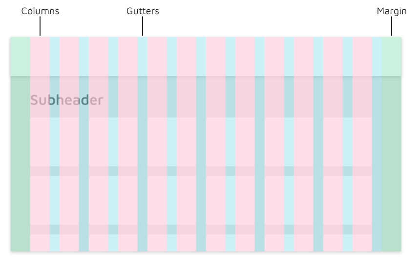
The layout grid is comprised of 3 elements: columns, gutters, and margins. Columns organize the main elements on the page, while gutters refers to the space between elements, both vertically and horizontally. Margins are located on the left and right of the page, and reference where the first column starts and the last column ends, horizontally.
We often use a standard 20px gutter between elements, typically in a card format.
Containers are the most basic layout element in Cirrus and are required when using our default grid system. Containers are used to contain, pad, and (sometimes) center the content within them. While containers *can* be nested, most layouts do not require a nested container.
Cirrus comes with three different containers:
- `.container`, which sets a `max-width` at each responsive breakpoint
- `.container-fluid`, which is `width: 100%` at all breakpoints
- `.container-{breakpoint}`, which is `width: 100%` until the specified breakpoint
The table below illustrates how each container's max-width compares to the original `.container` and `.container-fluid` across each breakpoint.
The table below illustrates the different breakpoints found in Cirrus
|
Extra small <576px |
Small ≥576px |
Medium ≥768px |
Large ≥992px |
Extra large ≥1200px |
Extra extra large ≥1560px |
|
|---|---|---|---|---|---|---|
.container |
100% | 540px | 720px | 960px | 1140px | 1500px |
.container-sm |
100% | 540px | 720px | 960px | 1140px | 1500px |
.container-md |
100% | 100% | 720px | 960px | 1140px | 1500px |
.container-lg |
100% | 100% | 100% | 960px | 1140px | 1500px |
.container-xl |
100% | 100% | 100% | 100% | 1140px | 1500px |
.container-xxl |
100% | 100% | 100% | 100% | 100% | 1500px |
.container-fluid |
100% | 100% | 100% | 100% | 100% | 100% |
Types of Containers
All-in-one
Our default `.container` class is a responsive, fixed-width container, meaning its `max-width` changes at each breakpoint. This style is helpful for designs that need to follow a strict layout. Each design can be created to match the list of breakpoints.
<div class="container">
  <!-- Content here -->
</div>
Fluid
Use `.container-fluid` for a full width container, spanning the entire width of the viewport. This is useful for large tools such as the Service Dashboard.
<div class="container-fluid">
  ...
</div>
Responsive
Responsive containers allow you to specify a class that is 100% wide until the specified breakpoint is reached, after which we apply `max-width`s for each of the higher breakpoints. For example, `.container-sm` is 100% wide to start until the `sm` breakpoint is reached, where it will scale up with `md`, `lg`, and `xl`.
<div class="container-sm">100% wide until small breakpoint</div>
<div class="container-md">100% wide until medium breakpoint</div>
<div class="container-lg">100% wide until large breakpoint</div>
<div class="container-xl">100% wide until extra large breakpoint</div>
<div class="container-xxl">100% wide until extra extra large breakpoint</div>
Smaller, Interior Containers
Some scenarios call for smaller containers for interior content. Within a page, we might need to display messaging or other relevant information for our users that does not follow our typical left-aligned structure. To improve readability and to privilege the ability to scan, we have set a defined width within the content of the page.
You can use any of our breakpoints as the container width, as long as the size of the interior container makes contextual sense for the content being displayed. Below are examples of potential widths and content.
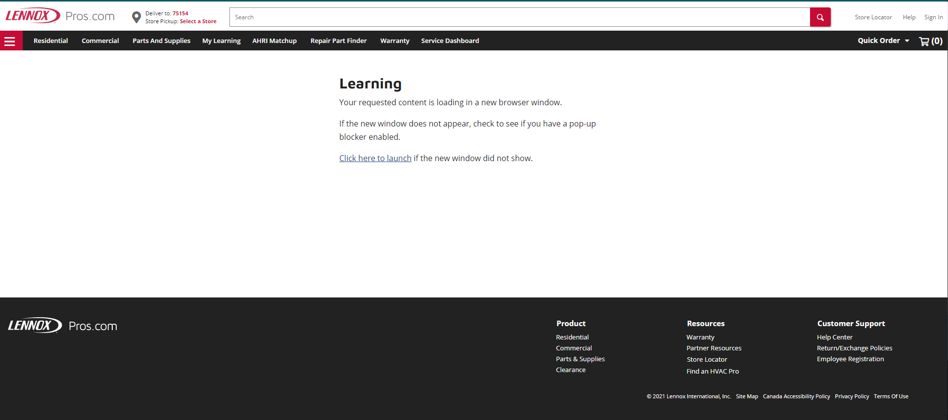
Learning - Small 576px
Your requested content is loading in a new browser window.
If the new window does not appear, check to see if you have a pop-up blocker enabled.
Click here to launch if the new window did not show.
Learning - Medium 768px
Your requested content is loading in a new browser window.
If the new window does not appear, check to see if you have a pop-up blocker enabled.
Click here to launch if the new window did not show.
Learning - Large 992px
Your requested content is loading in a new browser window.
If the new window does not appear, check to see if you have a pop-up blocker enabled.
Click here to launch if the new window did not show.
Learning - Extra Large 1200px
Your requested content is loading in a new browser window.
If the new window does not appear, check to see if you have a pop-up blocker enabled.
Click here to launch if the new window did not show.
<div class="container-start-sm">
  ...
</div>


<div class="container-start-md">
  ...
</div>


<div class="container-start-lg">
  ...
</div>


<div class="container-start-xl">
  ...
</div>
Responsive breakpoints
Since Cirrus is developed to be mobile first, we use a handful of media queries to create sensible breakpoints for our layouts and interfaces. These breakpoints are mostly based on minimum viewport widths and allow us to scale up elements as the viewport changes.
Cirrus primarily uses the following media query ranges—or breakpoints—in our source Sass files for our layout, grid system, and components.
// Extra small devices (portrait phones, less than 576px)
// No media query for `xs` since this is the default in Cirrus

// Small devices (landscape phones, 576px and up)
@media (min-width: 576px) { ... }

// Medium devices (tablets, 768px and up)
@media (min-width: 768px) { ... }

// Large devices (desktops, 992px and up)
@media (min-width: 992px) { ... }

// Extra large devices (large desktops, 1200px and up)
@media (min-width: 1200px) { ... }

// Extra extra large devices (large desktops, 1560px and up)
@media (min-width: 1560px) { ... }
We occasionally use media queries that go in the other direction (the given screen size *or smaller*):
// Extra small devices (portrait phones, less than 576px)
@media (max-width: 575.98px) { ... }

// Small devices (landscape phones, less than 768px)
@media (max-width: 767.98px) { ... }

// Medium devices (tablets, less than 992px)
@media (max-width: 991.98px) { ... }

// Large devices (desktops, less than 1200px)
@media (max-width: 1199.98px) { ... }

// Extra Large devices (desktops, less than 1560px)
@media (max-width: 1559.98px) { ... }

// Super massive large devices (large desktops)
// No media query since the extra-extra-large breakpoint has no upper bound on its width
Note that since browsers do not currently support range context queries, we work around the limitations of min- and max- prefixes and viewports with fractional widths (which can occur under certain conditions on high-dpi devices, for instance) by using values with higher precision for these comparisons.
There are also media queries and mixins for targeting a single segment of screen sizes using the minimum and maximum breakpoint widths.
// Extra small devices (portrait phones, less than 576px)
@media (max-width: 575.98px) { ... }

// Small devices (landscape phones, 576px and up)
@media (min-width: 576px) and (max-width: 767.98px) { ... }

// Medium devices (tablets, 768px and up)
@media (min-width: 768px) and (max-width: 991.98px) { ... }

// Large devices (desktops, 992px and up)
@media (min-width: 992px) and (max-width: 1199.98px) { ... }

// Extra large devices (large desktops, 1200px and up)
@media (min-width: 1200px) and (max-width: 1559.98px) { ... }

// Extra extra large devices (large desktops, 1560px and up)
@media (min-width: 1560px) { ... }
Similarly, media queries may span multiple breakpoint widths:
// Example
// Apply styles starting from medium devices and up to extra large devices
@media (min-width: 768px) and (max-width: 1199.98px) { ... }
Z-index
Several Cirrus components utilize `z-index`, the CSS property that helps control layout by providing a third axis to arrange content. We utilize a default z-index scale in Cirrus that's been designed to properly layer navigation, tooltips and popovers, modals, and more.
These higher values start at an arbitrary number, high and specific enough to ideally avoid conflicts. We need a standard set of these across our layered components—tooltips, popovers, navbars, dropdowns, modals—so we can be reasonably consistent in the behaviors. There's no reason we couldn't have used `100`+ or `500`+.
We don't encourage customization of these individual values; should you change one, you likely need to change them all.
$zindex-dropdown:          1000 !default;
$zindex-sticky:            1020 !default;
$zindex-fixed:             1030 !default;
$zindex-modal-backdrop:    1040 !default;
$zindex-modal:             1050 !default;
$zindex-popover:           1060 !default;
$zindex-tooltip:           1070 !default;
To handle overlapping borders within components (e.g., buttons and inputs in input groups), we use low single digit `z-index` values of `1`, `2`, and `3` for default, hover, and active states. On hover/focus/active, we bring a particular element to the forefront with a higher `z-index` value to show their border over the sibling elements.